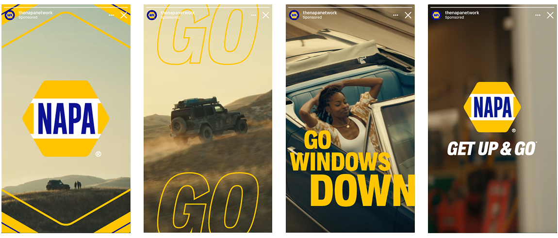
NAPA wanted to modernize their brand and speak to a younger audience. We ditched the slapstick humor and old way of thinking by sunsetting the “Know How” tagline and developing a brand that encouraged people to get out in the world again.
Part of that journey was to modernize a logo that had been neglected and abused over time without destroying the cultural icon it had become.
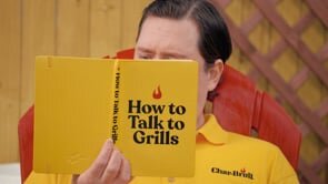
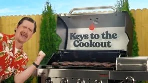
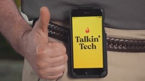
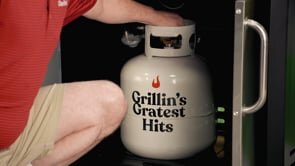
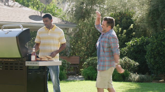
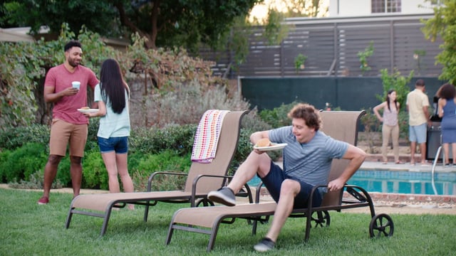
Char-Broil grills are often an entry point to an intentionally confusing grilling category. To help clear the air and school the new school, we introduced Grill Dad. A fun-loving, dad next door type slinging all the fatherly wisdom in a way that only Grill Dad can.
Electrolux asked us to bring their “Better Living Means” platform to the US.
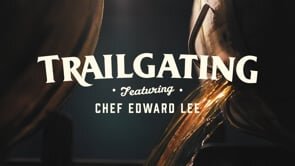
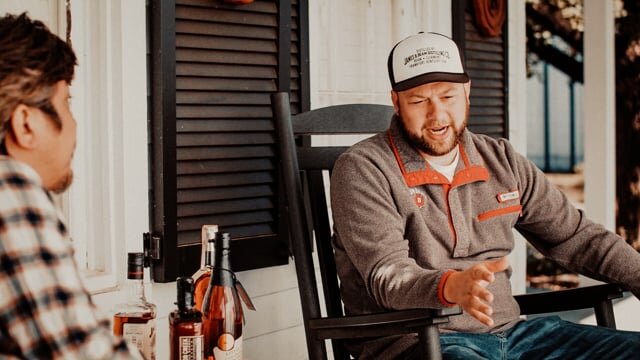
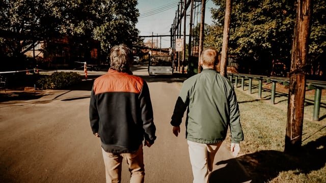
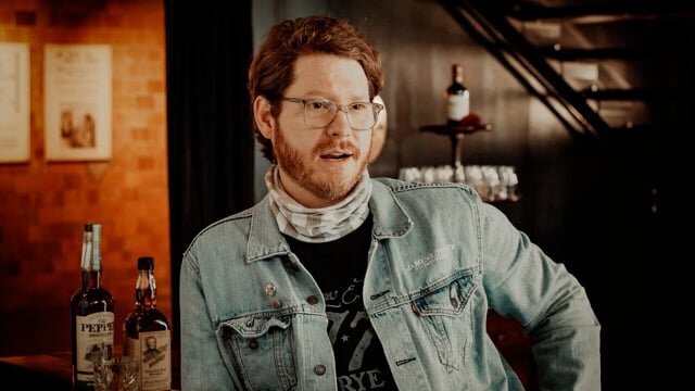
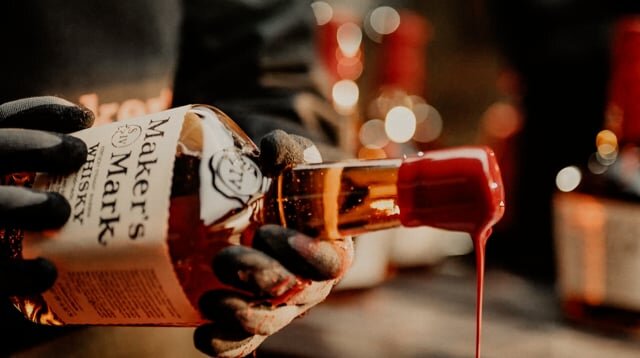
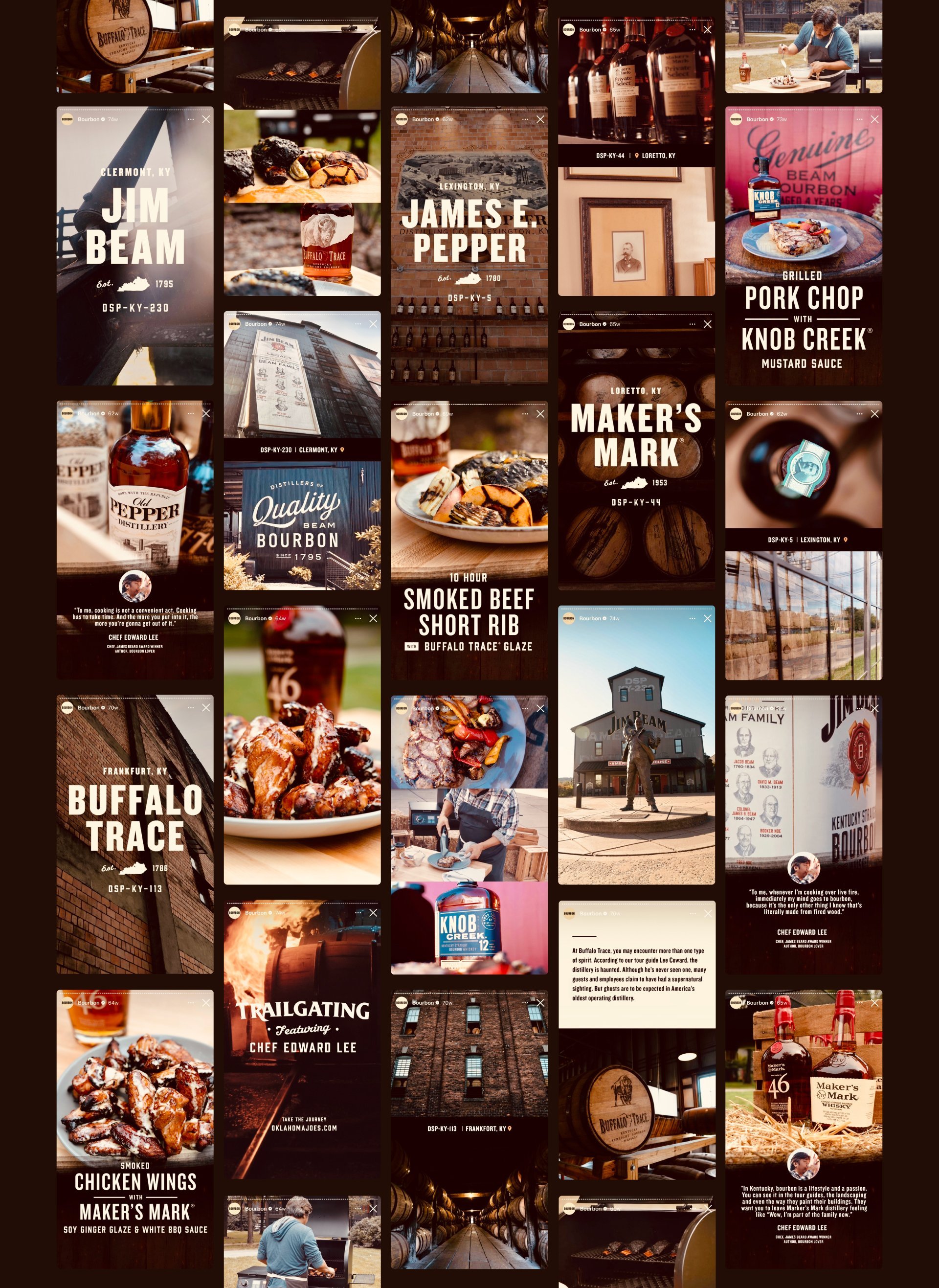
The affinity between smokers (not those smokers) and bourbon is strong. So we found a way to connect the two in a unique way thats equal parts entertainment and education.
This 4-part series produced long and short form content that became hundreds of social assets intended to fill the long hours of the smoking process.
Sunshine Beverage Co. grew from a revolt against the motocross space-jumping energy drinks that rock the landscape. With natural ingredients and energy derived from electrolytes and cane sugar, we created a brand to appeal to a health conscience consumer that wants a pick-me-up not a punch in the face.
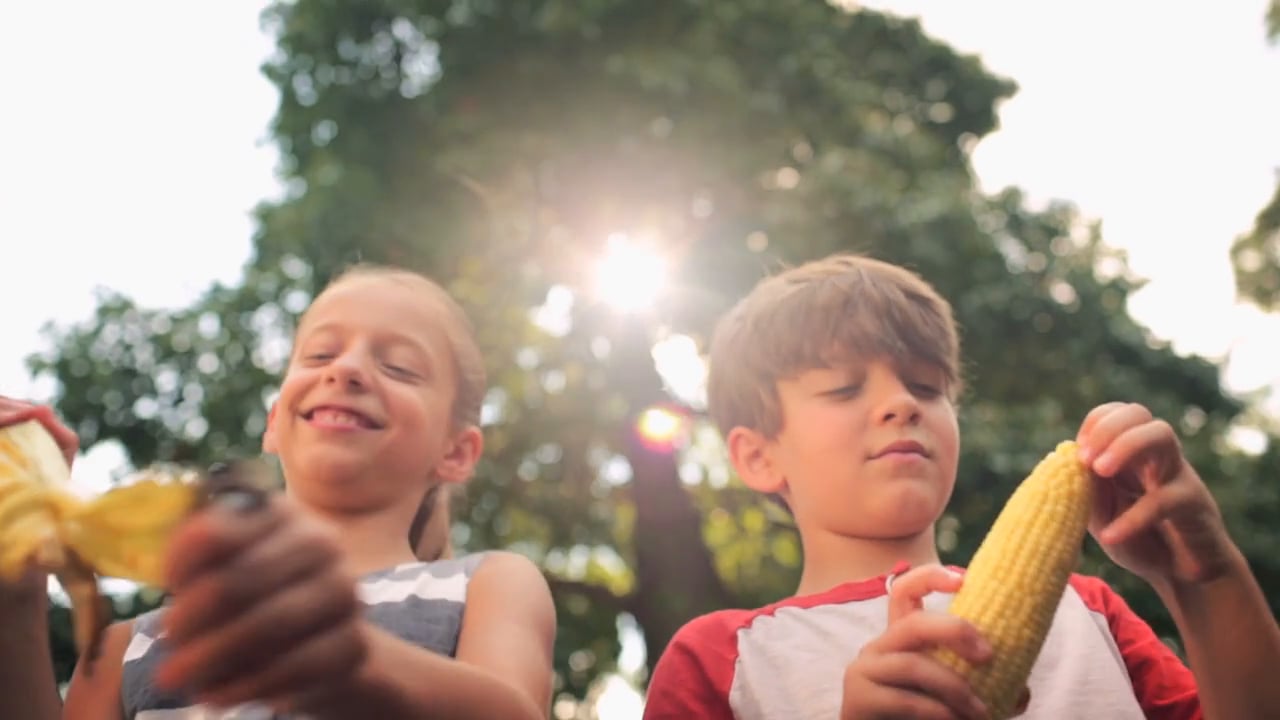
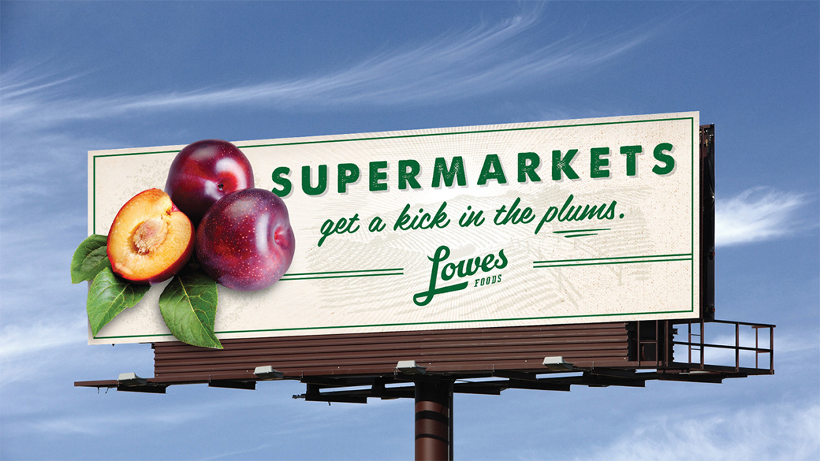
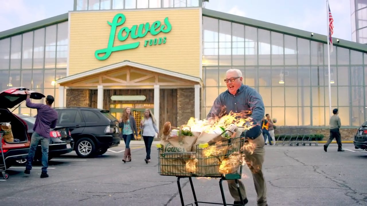
Lowes Foods came to us looking for a complete brand reinvention. As in, new everything across all media and collateral.
They're one of the few remaining local, family-owned grocery stores in the Southeast, so we want their heritage to come through loud and clear, while still being provocative enough to make noise in a stale category.
Rebrand Campaign - "Best in Show" 2015 American Advertising Awards in Charlotte
Coming off the success of launching the “Now You’re Cookin” brand campaign we shifted our focus to the news for Char-Broil. Translating Tru-Infrared Cooking Technology into something the consumer could understand.
Adidias was looking to strengthen their sales and relationship with sports retailer Scheels throughout the US. At their Overland Park location, they broke out the big guns: World Series Champion and Kansas City third-baseman, Mike Moustakas, would make an in-store appearance for a meet-and-greet/autograph signing. The brand reached out to me to help promote the appearance socially and create a custom t-shirt design exclusively for the first 500 people in line.
*Official Selection to the 2016 River Run Film Festival
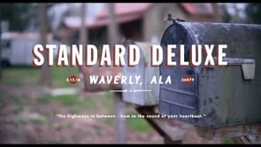
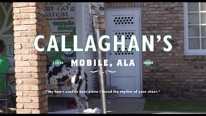
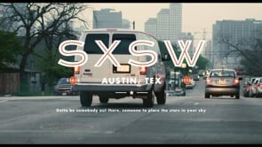
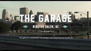
In the spring of 2016 we hit the road with country music singer/songwriter Caleb Caudle as he toured the south en route to SXSW in Austin, TX. Along the way we told the story of what “home” means to each of us. This docu-series across multiple outlets and was feature in the River Run Film Festival in Winston-Salem NC.
Concepted and directed by me. Special thanks got to Emily Morgan for shooting, editing, and put up with me for 18 hours in a car.
As the Hardest Working, Smoothest Riding ATVs in the world, Polaris was consistently looking to push the boundaries of capability and toughness.
Wrangler was looking for a way to appeal to the new generation of "cowboy." Through the of/500 brand we created a concept that spoke to the adventurer in all of us. With the brand only creating 500 of each cut, we created a demand and experience worth sharing.
Gentleman Jack lacked a brand that consumers could identify with, so we created the A Drink To Remember campaign that harkened back to what it meant to be a true Gentleman. With Sinatra Selects in the works for Brown-Foreman, Frank was a natural addition to the campaign.
Peter Millar is a high-fashion apparel brand that takes classic European designs and incorporates a unique southern twist. "Designed in the American South" was a way to put Peter Millar on an international stage, but remind everyone of their roots.
Element 4 is a sub-brand that used Peter Millar's natural connection to golf to create a high-end athletic product.
Logo design is the backbone of being able to prove out a concept in the most efficient way possible. A few of my favorites are below:
1. Organtic - an organic plant food made from recycled tobacco waste that yields some pretty amazing results.
2. NAPA - How do fix a 50 year old beloved brand? You don’t mess it up. Just a nip and tuck for legibility to make sure you stay an icon.
3. Winston-Salem Dash - The project of my dreams. Make a minor league ball club a logo that feels major league and represents our city.
4. RoadWorthy Car Club
5. Coca-Cola - Various logo concepts for a variety of global campaigns.
6. Polaris Electric Vehicle
7. Element 4 - Sports apparel brand designed to compete with other high-end luxury brands.
8. Greenhorn Car Club
9. Garrett Law - Albuquerque based Law Firm
10. Earth Roamer - Luxury cab-over, off-road vehicle manufacturer.
1. Dentarius Locke - Promotional materials for an Olympic track star looking to appeal to an elite set of national sponsors.
2. Hewlett-Packard Disney Skins - Partnership with HP's "the computer is personal again" campaign and Disney Parks.
3. Bojangle's Event Posters
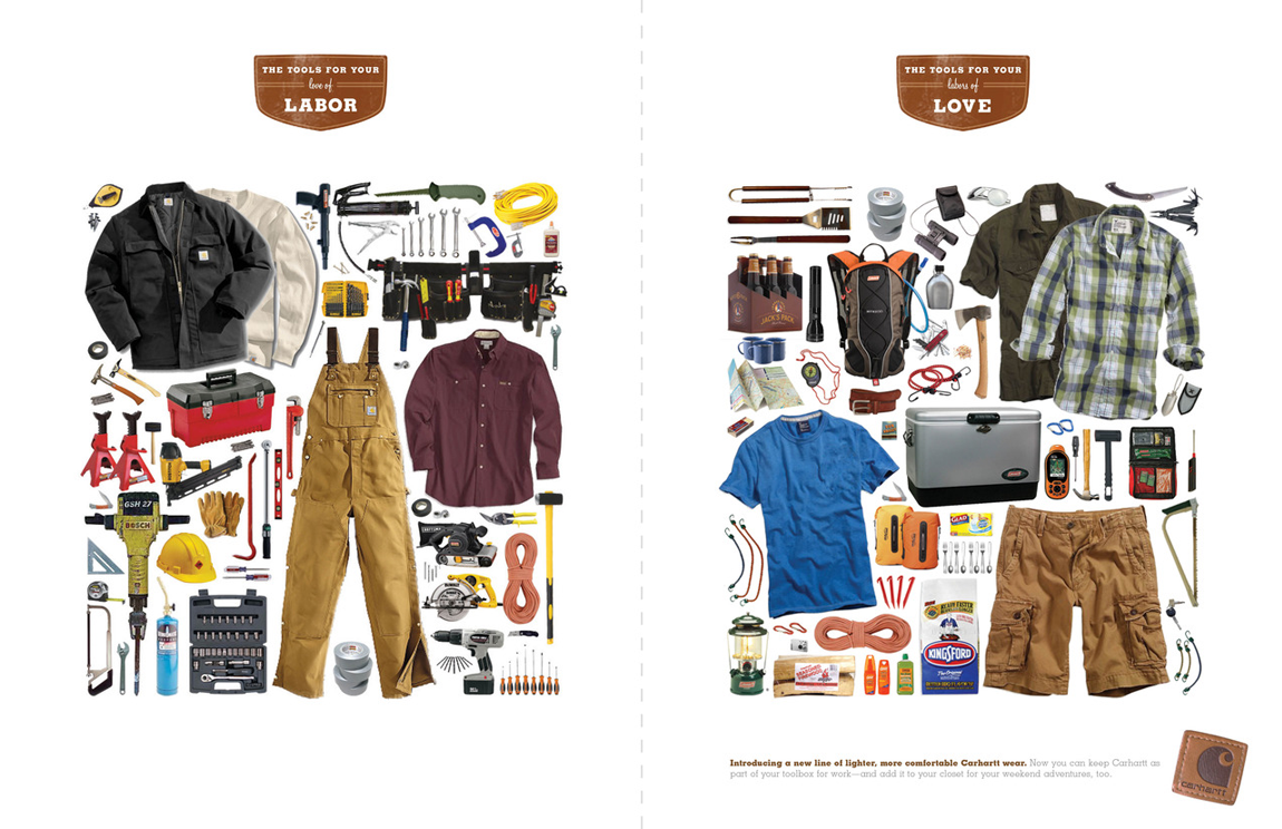
4. Carhartt Summer Series Print - New summer product launch that reflects Carhartt's hard working reputation.
5. Hanes/Target comfort select display
6. Puma - Innovative partnership concept with NBC's launch of the Hunger Games reality show.
7. Puma Goodwalk - Charitable promotion for Puma tech that turns sponsored athletes' movement into charitable giving.
8. FanUp - App created to encourage fan engagement in stadium on any given Saturday.
Steamboat Resorts was looking for a way to connect with families and encourage them to come back by reminding them of how special of a place Steamboat can be. As a reminder, we used the names of actual runs they may have experienced to create short stories about the feeling only Steamboat can provide.
The design is clean and white to hide our limited photography resources and the lines mimic a trail map to bring the concept back full circle.
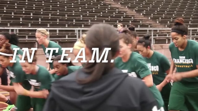
We were tasked with rebranding an athletic clothing brand known only for youth cheerleading and fold over cotton shorts. The company poised to launch an entire new line of fit-to-fashion apparel that aspired to be in the consideration set of the Lululemons of the world.
Our answer? Certainly not another "I am a warrior" egocentric message. Rather, harness the power of the collective. The truth that women are better and stronger together than individually. Hence, The Strength Is In Us rebranding campaign.
The concept eventually made its way into the military segment of products.